Climate Canard No. 2: 'Warming Has Stopped' - A Very Temporary Duck
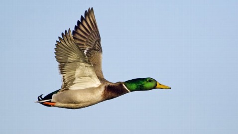
(Getty Images)
Four simple graphs give the lie to the denialist canard that rapid global warming has stopped… or even reversed. - "A half a truth is a whole lie."
Nature's Edge Notebook #26
Observation, Analysis, Reflection, New Questions
This flying duck is expected by the world's climate scientists to soon crash and burn.
The four simple graphs below instantly give the lie to Climate Canard No. 2 - the claim that "in the past decade it just hasn't warmed much at all" … or "global warming has stopped" … or even that "global temperature is now cooling."
As explained in previous Nature's Edge Notebook #24, the origin of the English word canard (meaning "an unfounded or false, deliberately misleading story") probably stems from the French phrase, vendre un canard moitié, which means "to half-sell a duck; to swindle."
It's akin to an old proverb quoted by widely respected climate scientist Michael Mann:
"A half-truth is a whole lie."
The half truth in this canard (actually, it's a far tinier fraction than that) is that the long-term rise in the overall annual global temperature has leveled off since the year 2000.
Problem is, the aggressive rise in global temperature never goes up in a smooth line, straight or curving, when plotted from year to year, and was never expected to.
The world's alarmed climate scientists have long set a tougher standard for "global climate trends," requiring averages over 20 or 30 years, and their alarm is only growing.
As you can see in graphs below, global temperature is always an up and down of sharp zig-zags … until you measure it in averages of 10 years or more, as climate scientists have always insisted as they try to show the public the frightening big picture that professional climatologists must live with every day.
This first graph combines data from three U.S. federal agencies, all widely respected by climate scientists around the world: NCDC, NESDIS and NOAA - the National Climate Data Center; the National Environmental Satellite, Data, and Information Service; and the National Oceanic and Atmospheric Administration. 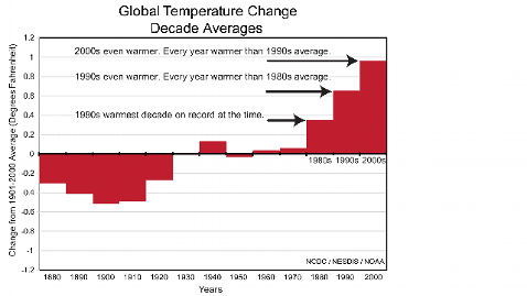
Note its statement that, since 1980, every year in each succeeding decade is warmer than the average temperature of the entire previous decade - rising steadily through the 1980s, the 1990s and the 2000s.
Note also that when graphed this way, with red bars, you get a sense of how the problem is "piling up" - in the increasing red area of the graph from left to right as the years pass.
This reflects that fact that, as climate scientists have found, much of the excess heat-trapping greenhouse gas CO2 emissions from human activity stays in the air for hundreds of years, piling up heat on top of more heat.
(The black "baseline" in the center of the graph is the average temperature of the entire century 1901-2000)
The slight dip in the 1950s is believed by climate scientists to have been caused at least partly by the post-World War II economic boom, which produced great amounts of industrial smog whose tiny particles reflect warming sunlight back into outer space - as does the thick smoke from volcanoes.
This next graph, plotted by climate scientist Katherine Hayhoe of Texas Tech University, looks more closely at global temperature since 1970, going year-to-year.
It exposes "the myth of cooling" - that version of Canard No. 2 in which denialists even claim that "global temperature is cooling," which they do by cherry picking only the past five or six years, which is a tiny fraction of the temperature record:
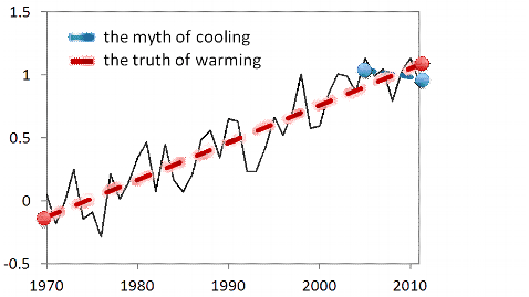
Alarmed climate scientists have always predicted there would be "brief pauses and dips" in the global air temperature rise … and that even as they were occurring, new global warming would still be working its way through deep ocean currents, as has also proved to be the case.
Medical metaphors often arise as scientists explain global warming - including with this canard that "the earth is cooling."
Like Saying Your Terribly Sick Child Is Probably OK
"It would be like saying your terribly sick child is probably OK because her fever of 104.3 has briefly dropped to 104.2," as veteran climatologist Richard Somerville, emeritus professor at the Scripps Institution of Oceanography in San Diego California has told ABC News.
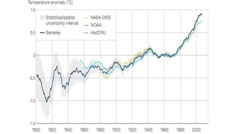
This next graph shows the global annual average temperature over a much longer period, from 1800 to 2010.
It shows global land-surface temperature readings compiled by four separate institutions.
Three of them are in the United States (NASA-GISS, NOAA, Berkley) and one in the United Kingdom, (HadCRU - the Climate Research Unit of the Hadley Centre of the UK's "Met Office," which deals with meteorological and climatic observations and related studies.)
Notice how the gray "uncertainty intervals" grow less and less as the four different readings merge in the 1850s.
Notice also how the larger swings up and down, partly due to natural variability, grow smaller and smaller, finally settling into a steady rise in global temperature over the past 40 years, starting in about 1970.
This graph is from a PowerPoint presentation used by Stanford Professor Naomi Oreskes, author of "Merchants of Doubt: How a Handful of Scientists Obscured the Truth on Issues from Tobacco Smoke to Global Warming."
Again, as with the similar decline and plateau in the first graph above, the dip in the global temperature from about 1942 to 1970 is believed by climate scientists to be due partly to the intense industrial activity of World War Two and the economic boom that followed.
The gray and black particles in the smoky emissions from factories actually help cool the earth by reflecting some of the warming sunlight back into outer space, thus preventing it from hitting the earth where it changes into the invisible infrared light that is trapped by greenhouse gasses, warming the air.
Finally, here is a global temperature graph from NOAA and NCDC that plots the global temperature rise from 1880 to 2010.
It shows how closely the temperature has risen in step with increasing CO2 emissions, starting in about 1970.
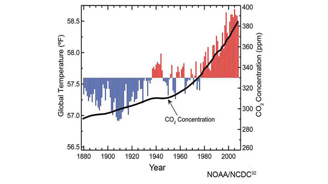
This graph matches the increasing rise in global temperature to the cause firmly established by the world's peer-reviewed scientists - excess CO2 injected into the atmosphere by human activity.
As with the first graph above, the center-line is the average global temperature of the century from 1901 to 2000. (This graph is different from some other similar graphs in that it averages temperatures over both land and the oceans.)
Not the Elephant in the Room, but the One We're Inside Of
These graphs, whose simple readings are accepted without any controversy by virtually all of America's and the world's professional climate scientists and other responsible authorities, show that, as one observer has put it, manmade global warming is not the elephant in the room, it's the elephant we're all inside of.
Veteran climate scientists in the United States, frustrated with the falsely politicized climate science arguments that are fueled partly by canards such as this one, sometimes remark that "there are no Republican thermometers and Democrat thermometers," while pointing out that graphs like these (which are simple to understand and are being taught to middle school students around the world) are essentially just careful professional readings from thousands of different thermometers around the world.
A Very Temporary Duck - in Onrushing Effects of Global Warming
Even without the plain evidence of these simple temperature graphs, the continually advancing effects of manmade global warming are clear in the ever increasing news flooding in everywhere from around the world.
Taken together, they also put the lie to the empty claims that the warming has stopped.
They are countless. But just for example, scientists have now discovered that Antarctic Ice Sheet "shelves" (giant slabs of ice sticking out into the ocean) are continually melting from beneath, faster than previously thought, due to increasing exposure to warming sea currents - a melting that continues steadily out of sight below regardless of cold spells in the air above them.
A new study in the journal Science firmly links manmade global warming to ever greater threats of extreme weather - drought, fierce winds and intense rainfall and flood - affecting large regions in the United States and many other countries around the world, a trend we reported in the previous Nature's Edge Notebook No. 25.
There are now countless other peer-reviewed scientific studies emerging daily around the world that show manmade global warming has not stopped at all, but is continuing its rapid rise.
Climate Canard No. 2 looks like a very temporary duck.
------ We invite you to follow our weekly Nature's Edge Notebook on Facebook and on Twitter @BBlakemoreABC
Find more on our Nature's Edge website at www.abcnews.com/naturesedge