Elections Today
- Pennsylvania
Recent Projections
| State | Candidate | Delegates |
|---|---|---|
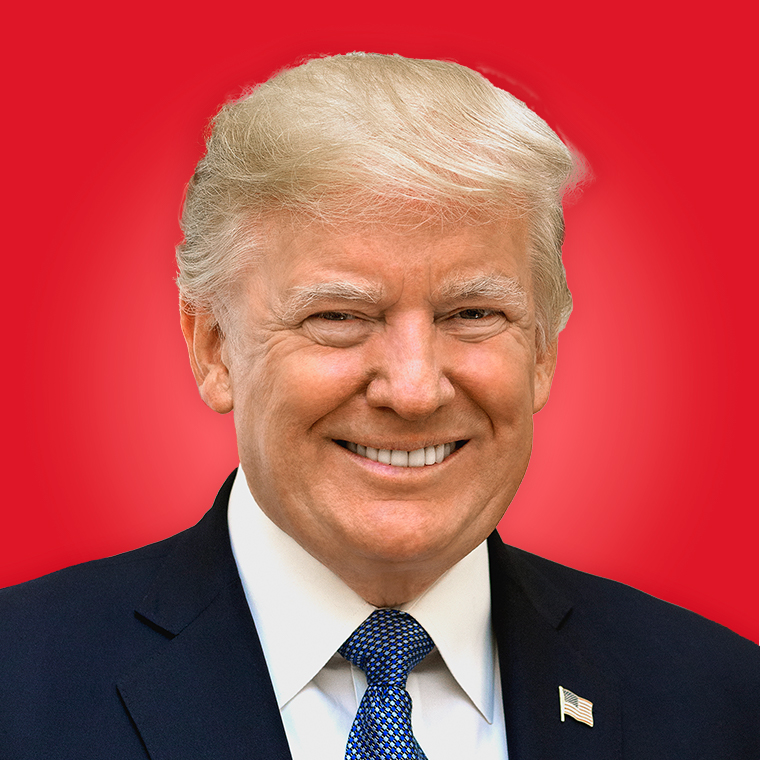 Donald Trump | ||
Pennsylvania | 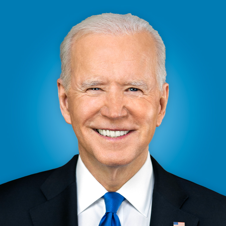 Joe Biden |
Uni Watch contest results: How you would redesign the Lions
— --
Or do you? Some readers approached the job with a pair of tweezers, others with a sledgehammer. Here are some of the best and most interesting submissions we received. In each case, you can click on the design to see a larger version of it.
Best new logo and helmet treatment: Travis Bergeman
The Lions' helmet mascot, nicknamed Bubbles, is classic and familiar. But Bubbles has always had a bit of a circus-ish look to him, like he's being toyed with by an unseen lion tamer. Several readers decided to update the team's helmet mark by replacing Bubbles with a lion's head, most notably Travis Bergeman, who came up with a spectacular new logo and then wrapped it around the helmet. The resulting design looks equal parts ferocious and majestic -- truly a king of the jungle.
While we're at it, Bergeman also came up with some rather futuristic-looking uniform designs. The home and road versions don't work so well, but check out the black alternate.
OK, so it's very Tron-ish. But it's one of the best Tron-ish designs I've seen. Not sure if it's a good fit for the Lions, but some team out there should probably try something like this.
Best road uniform: Alex Rocklein
Back in 1998, the Lions wore blue pants with their white road jersey. Several readers revived that idea in their entries, none more successfully than Alex Rocklein (who was also a standout entrant in our recent Rams redesign contest), who improved on the '98 version by adding striped socks and tweaking the striping on the helmet and sleeves. And hey, if you're going to stick with the old circus-style Bubbles logo, why not pair it with a circus-style number font? Nicely done.
Best old element made new: Randy Miller
Back in the 1960s, the Lions' primary logo was a lion prowling against a background of blue and silver vertical stripes. Those vertical stripes have resurfaced here and there over the years (they appear on the team's current William Clay Ford memorial patch, for example), but several of our readers proposed making them a more prominent part of the Lions' look. The most successful of these designs came from Randy Miller, who updated the old logo by making the vertical stripes slightly diagonal and then put it on the team's helmet and hips. Miller's color scheme isn't so great, but the way he has dusted off this old logo is something the Lions could learn from.
Tim Donovan went further, having the stripes run across the sides of the helmet, instead of the more traditional front-to-back format.
Would that actually look good on the field? Maybe, maybe not, but it's an interesting idea and a clever way to update the team's look while drawing upon its past. (Others who used the vertical stripes to varying degrees -- sometimes as a logo element, sometimes as part of the uniform -- included DenverGregg, Patrick Blankenship, Josh Frederick and Joe Troyer.)
Best absurd but awesome concept: Gerard Milewski
What the heck is going on here? "I tried thinking of the last time the Lions were favored for a season, and it was probably before the Roman emperor Honorius outlawed gladiator games in 404 A.D., so that was my inspiration," Gerard Milewski says. "The lion-skin helmet and cloak were inspired by ancient statues of Hercules wearing the skin of the Nemean lion, the faux-leather armor shoulders, tasset belt and arm sleeve reflect Roman gladiator garb, and the socks are sheer with faux-leather stripes to appear as Roman sandals." OK, but what about those Roman numerals? "I checked," Milewski says, "and the NFL rulebook requires the numbers on front and back to be of a certain height and width, but it says nothing about them being Arabic. And besides, the NFL already uses Roman numerals for Super Bowls." Milewski even included a road uniform and -- get this -- a Color Rush version for Thursday night games (although, he acknowledges, "for the Thursday design I had to use yellow socks instead of sheer, creating the horrible impression of socks with sandals"). Now that, people, is a great design concept, even if it has zero chance of making it onto the field.
Honorable mention: Another good lion's head helmet logo came from Brett Jayroe. And Shaun Davies came up with a good lion's head but for some reason put it on only one side of the helmet, with a mini-check pattern on the other side. Thanks, but no thanks. ... Jack Potterack did something we've seen in other sports but not so far in football: He incorporated a city skyline into his jersey designs. ... Good attention to detail: Now that the Lions have worn the William Clay Ford memorial patch for two consecutive seasons, Cody Fullerton took the next logical step and made it a perma-memorial on the sleeve, similar to the Bears' "GSH" sleeve lettering for George S. Halas. ... As usual, the most intriguing things about Tom Bierbaum's renderings were the designs he came up with for the opposing teams, including a solid-pewter look for the Buccaneers and a new Chargers helmet with the lightning bolts spelling out "L.A.," in anticipation of the team's potential move to Los Angeles. And in case you can't make out the details of Bierbaum's helmet logo for the Lions, it's another one of his endearingly goofy mascot characters. ... Lots of interesting elements in Tessa Sainz's entry, including the wraparound helmet logo and the clavicle stripes that look like a lion's tail. Also, Bubbles looks surprisingly good as a chest patch. ... The Lions franchise was known as the Portsmouth Spartans for the first four years of its existence. Will Jones gave a shout-out to that chapter in the team's history by including a Spartans throwback in his design proposal. ... Presentation counts: Bonus points to Matthew Rose and Samuel Wilson, both of whom annotated their designs with helpful explainers. ... Several readers tried to reach across the Motown sports aisle by incorporating the Detroit Tigers' Old English "D" logo into their designs. The most interesting examples of this approach came from Steve Spurgeon and Dan Kennedy.
Want to see more? You can see all of the entries we received here.
Paul Lukas will be announcing more design contests soon. If you liked this column, you'll probably like his Uni Watch Blog, plus you can follow him on Twitter and Facebook. Want to learn about his Uni Watch Membership Program, be added to his mailing list so you'll always know when a new column has been posted or just ask him a question? Contact him here.

Related Stories

ABC News Live