Coke and Diet Coke Cans Should Be Polar Opposites, Buyers Say

Image credit: Coke
Don’t worry, Coke fans, those classic red cans are on their way back.
The Coca-Cola Co. told ABC News today that it would be following up last month’s release of its white, holiday “Arctic Home” cans adorned with polar bears with a “limited-edition” red version. The Arctic Home campaign will run through March 2012
“We launched ‘Arctic Home’ to raise awareness and funds for the polar bear. … We committed up to $3 million to World Wildlife Fund and are encouraging others to join us in helping protect the bears and their habitat,” spokesman Rand Carpenter wrote via email. “The plan is to continue shipping the billion-plus white cans until they run out and we are nearing that now.”
Some consumers told ABC News today that although they liked the message behind the redesign, they mixed up the white can with Diet Coke.
“We were confused and did think it was diet at first,” Lucie Kamuda McHan commented on Facebook. “I understand why they are doing it, but they still could have kept them red and just painted white polar bears on them. I like the red ones better.”
“I purchased three six-packs because I thought they were diet,” Gail O’Donnell of Danvers, Mass., told ABC News via email. “I drank one and wondered why it tasted so good. I didn’t look at the can. … I am a diabetic and can only drink diet sodas. … They need to make it so it is not confused.”
Others said the beverage tasted differently in the white can, but Carpenter told ABC News the beverage’s ingredients were the same.
“Whenever we change our packaging, we nearly always hear from a handful of people that believe the taste is different,” he said. “Of course, it isn’t.”
Sam Craig, a marketing professor at New York University’s Stern School of Business, said that although he didn’t believe Coke’s brand would be tarnished or altered by backlash, the message was clear: “Don’t mess with the brand.”
“The fundamental thing is that people don’t like change,” he said.
In 2009, when PepsiCo ditched the straw-in-the-orange logo on the packaging of its Tropicana Pure Premium orange juice, customers did more than complain. Many stopped buying it.
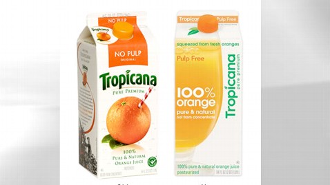
Image credit: Tropicana
From January, when the new packaging was launched, until February, sales of the juice dropped 20 percent, according to Advertising Age.
PepsiCo scrapped the new packaging and brought the orange back. The failed redesign cost the company a reported $35 million.
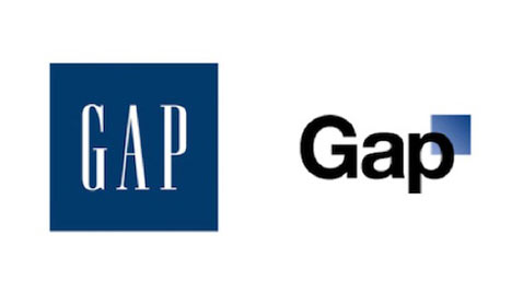
Image credit: GAP
In October 2010, Gap sought to replace its more than 20-year-old blue square logo with a more contemporary design. Within days of the launch, the retailer had done away with the idea after consumers took to Facebook and Twitter to voice their outrage.
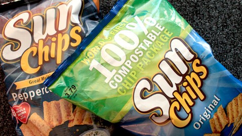
Image credit: Mary Altaffer/AP
And earlier this year, Frito-Lay released a quieter compostable bag for its SunChips brand after a 2010 redesign was pulled from the shelves because of complaints that it was just too loud.
As for Coca-Cola, Carpenter would not comment on sales during the “Arctic Home” promotion but said the company was “excited about the positive impact this campaign is having with our consumers and customers to help protect the polar bear’s home.”
As of Tuesday, more than $137,000 had been raised for the animals.