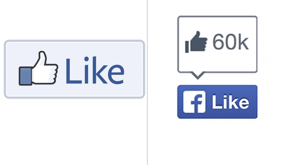
Facebook Debuts New Like and Share Buttons for Websites
The thumbs up is replaced by Facebook's lowercase f.

Nov. 6, 2013 -- Take a look at the left side of the screen. Notice anything different? It's not just your imagination. That's a brand new Like button you're seeing.
"Today, we're introducing a new design for both Like and Share to help people share more great content across the web," said Ray He, a software engineer at Facebook. The Like button no longer sports the company's famous cartoon thumbs-up, but instead brandishes the Facebook lowercase f.
Facebook has also made the logo a darker shade of blue, as well as changed its font. In addition, it is giving websites the option of lumping the like and share buttons together. "We're already seeing a favorable increase in Likes and Shares with the new design and will be rolling these buttons out to everyone in the coming weeks," said He.
It's almost hard to remember a time when Facebook wasn't synonymous with "liking" or "sharing" something. An old Tech Crunch article sounds downright quaint when describing the birth of the two buttons. "Today, you can 'share' content with Facebook via a simple button," wrote Michael Arrington, back in 2010. He added that Tech Crunch readers could try it for themselves at the top of the post.
Finding an old version of the Like button is starting to feel like a needle in a haystack. Many websites have already undergone the transformation. But if you really need your thumbs up fix, you can still see it on Facebook's own pages.
At least for now.


