Redesign your space with tips from these ‘Trading Spaces’ designers
Vern Yip and Laurie Smith are two of the designers returning to the show.
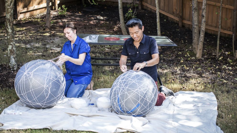
If you don't prefer your own home over staying in a 5-star resort, "something is wrong."
That's the design philosophy of Vern Yip, an interior designer extraordinaire who has brought his talents back to the reboot of "Trading Spaces."
"If you're not walking through your front door every day and instantly loving where you're at and being re-energized, you should do what you need to do to change it," Yip told "GMA." "It is your home."
Changing your home can be as simple as tackling one room, even if you don't have Ty Pennington as your carpenter or even $2,000 to spend, according to Yip and another beloved "Trading Spaces" designer, Laurie Smith.
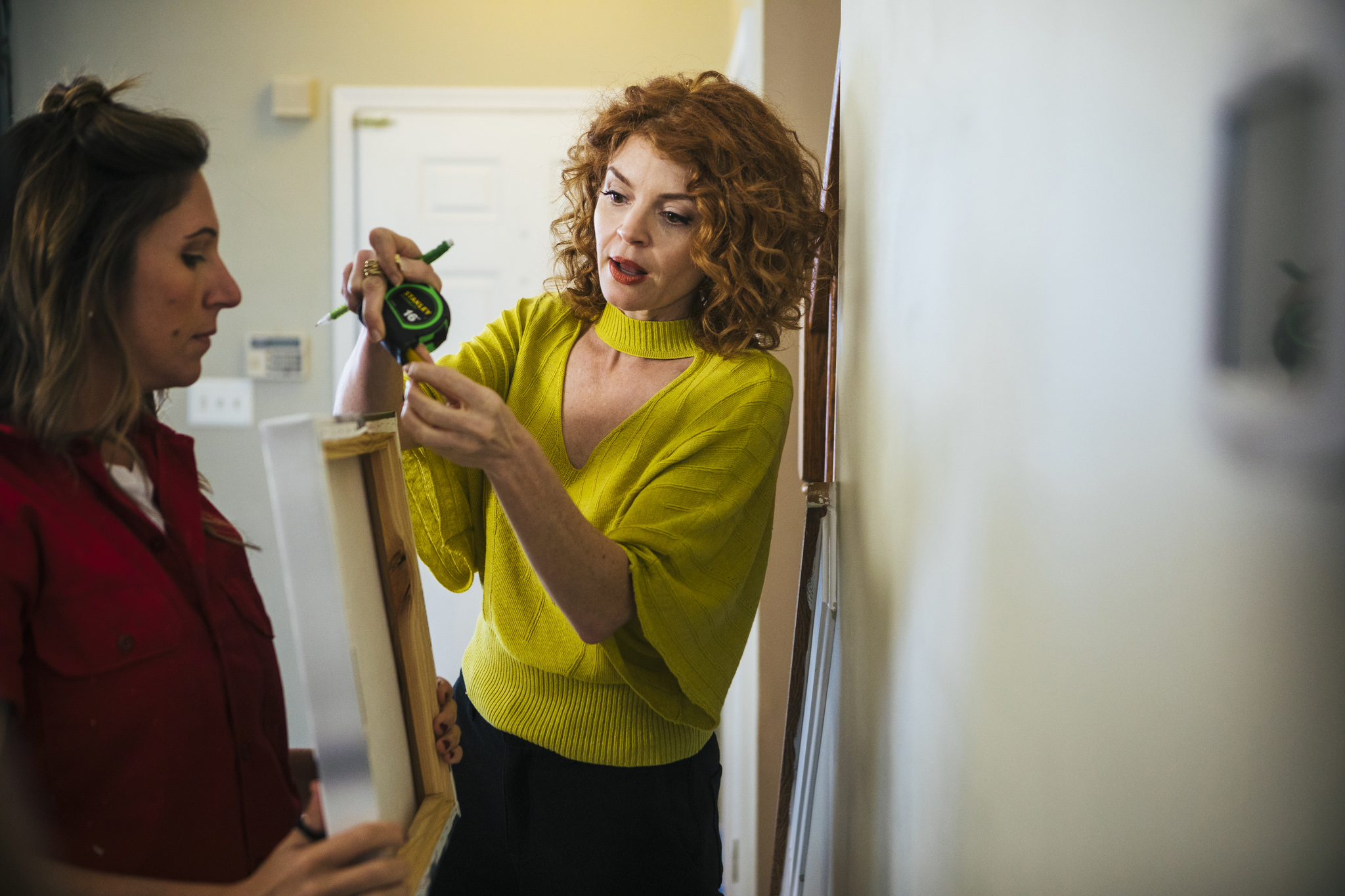
"The point I've always tried to do with 'Trading Spaces' is to open people's mind that they are not one-dimensional," Smith told "GMA." "You are not a gray wall and a white sofa. There are ways to express yourself."
Whether you want to express yourself with hay on the wall -- a design one "Trading Spaces" homeowner may still be cleaning up -- or using an inflatable exercise ball and yarn as a DIY light fixture -- as Yip attempts in the newest episode -- Smith and Yip are here to help.

With more than 12 seasons of "Trading Spaces" and decades of interior design experience between them, these designers know some tricks.
Follow their tips to do a "Trading Spaces"-style transformation of your home.
Vern's 4 design rules of the road

1. Have an 'honest conversation'
Before you begin a redesign, be honest about how you use rooms throughout your house. That can help inform which room is important for you to redecorate, or decide if you want to make bigger changes in multiple rooms.
"Have an honest conversation with yourself and the people who live in your house and determine what makes sense for you as a family," Yip said. "Make designations about rooms and what they're really used for."
He added, for example, "Have the conversation about whether you really need a formal dining room. Is that something you will use? Is that something you want?"
2. Skip placeholder objects
"Whether or not people realize it, every single thing in your home is sending you a message," said Yip. "You're better off surrounding yourself with the messages that you want to hear, and you have control over that.

"Buy stuff that has real meaning and is of quality and will endure."
3. Go organic, even in design
Yip calls items like plants and fruit "affordable organics" that can add layers to your room.
"I always love a bowl of apples," said Yip, who revealed in the early days of "Trading Spaces" he would use apples from his hotel's free breakfast as a design element.
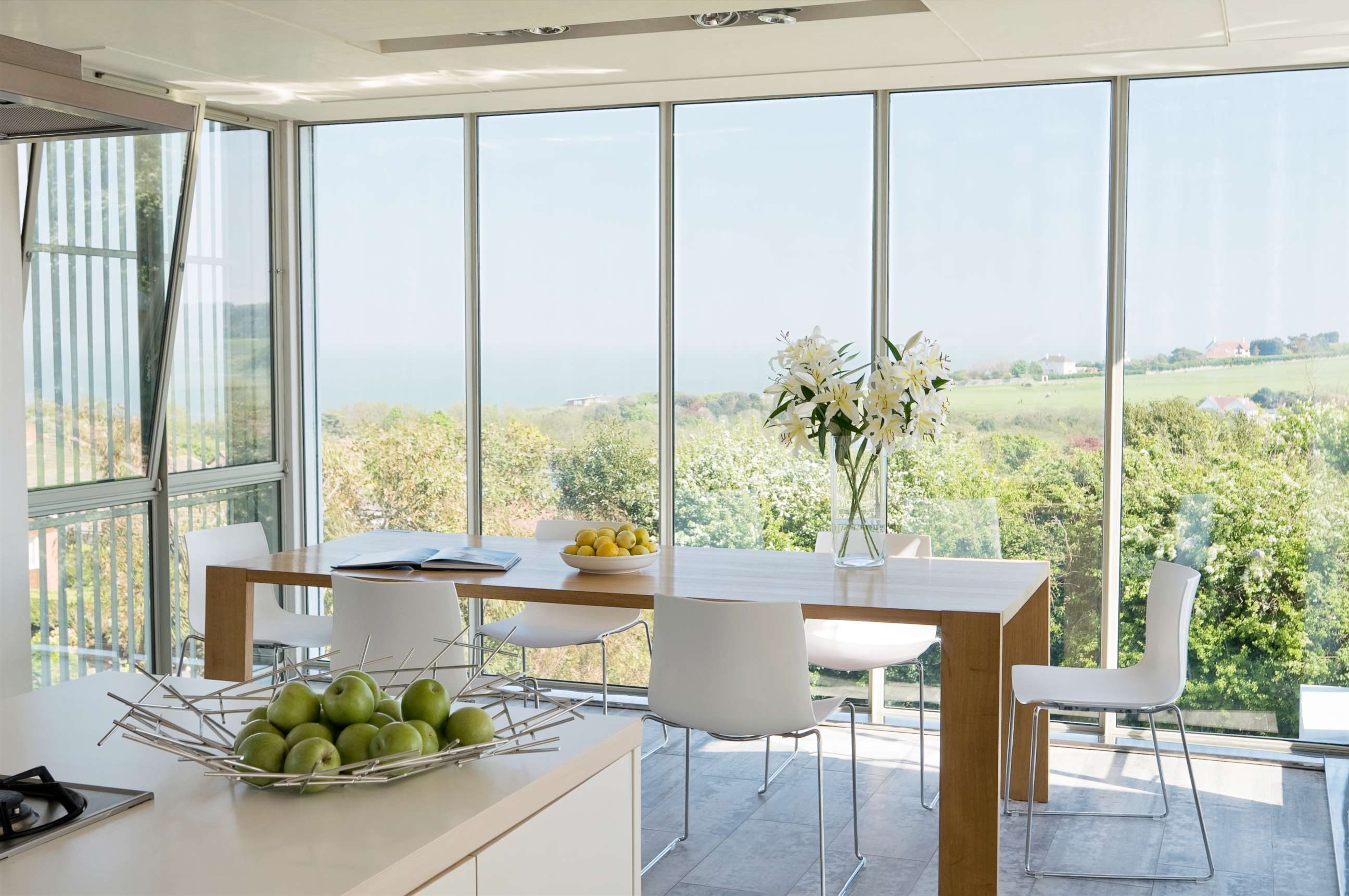
"You can buy a bag of apples for like $2 to $5," he explained. "If you buy two to three bags, they'll last in a bowl and look great as a punch of color for three to four weeks."
Another idea is an orchid plant, which Yip said you can buy for less than $20 and watch it flourish with minimal effort.
"All you really need is bright, indirect sunlight and to minimally water it, and you get fresh flowers for eight to nine weeks."
4. Use books to add 'soul'
"I like books in almost every room of the house," he said. "They tell stories about who you are and they really help warm [a room] up."
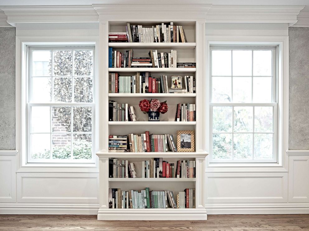
Move books beyond the bookshelf and coffee table to end tables, bedside tables and side tables in the living room, Yip suggests.
Laurie's 3 transformative tips
1. Pick your design, then your paint
Contrary to what you see on "Trading Spaces," picking your paint color should be the "icing on the cake" of your design process, not the first thing you do.
"The wall color is really the final touch," said Smith, who noted she has never used the same paint color in more than 150 "Trading Spaces" episodes.
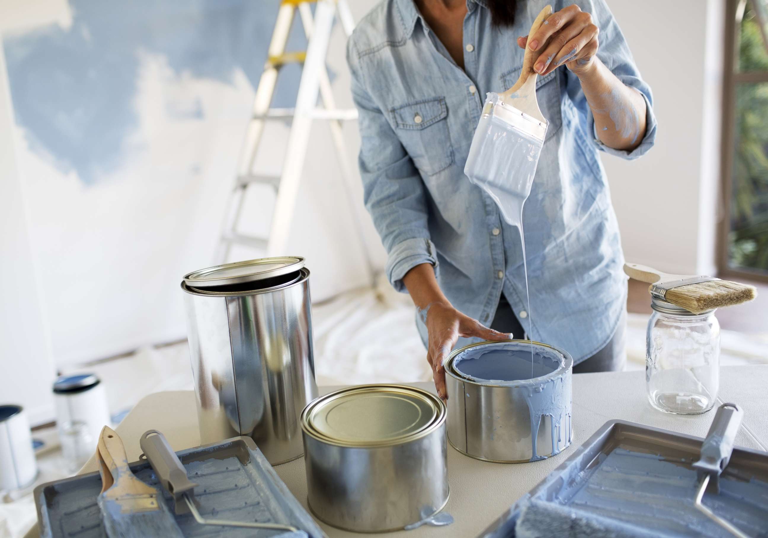
"I start to put the [furniture] puzzle together, then I bring in textiles, then upholstery, the color schematic takes shape and then the absolute icing on the cake is the wall color."
Start with a piece of inspiration
"In my own personal living room, my inspiration piece is this murano glass seashell that my grandmother gave me," she said. "What it inspired for me is the mood that I wanted to evoke in that space: Graceful lines with a restful quality to it."
"I find if people start with an object that is personal and is the mood they want to evoke in the room, it becomes a touchstone when things get crazy."
2. Sketch it out
"I am always encouraging people if they cannot hire a designer, to take specific dimensions of their room, take dimensions of their existing furniture and get a piece of graph paper," she said.

"Cut out templates of your [furniture]. Like puzzle pieces, work the pieces around on your graph paper."
3. Follow your gut
"I encourage people, this is their space so if it speaks to them, listen to their gut. No one else is going to live there," she said. "It’s got to make you feel happy. It’s got to make you feel like you want to spend time there."
"If there is a fabric that maybe is a little off the beaten path but you like it, or a throw pillow or a vase or a piece of artwork, something that maybe is a little out of your comfort zone but is speaking to you, listen to that. That could be your inspiration piece."
Laurie and Vern's tried-and-true design rules
Yip, the author of "Design Wise," and Smith, author of "Discovering Home," use their years of design education and experience to share four simple rules of thumb.
These are design rules that apply, they say, whether you live in a studio apartment or a 10,000-square-foot mansion.
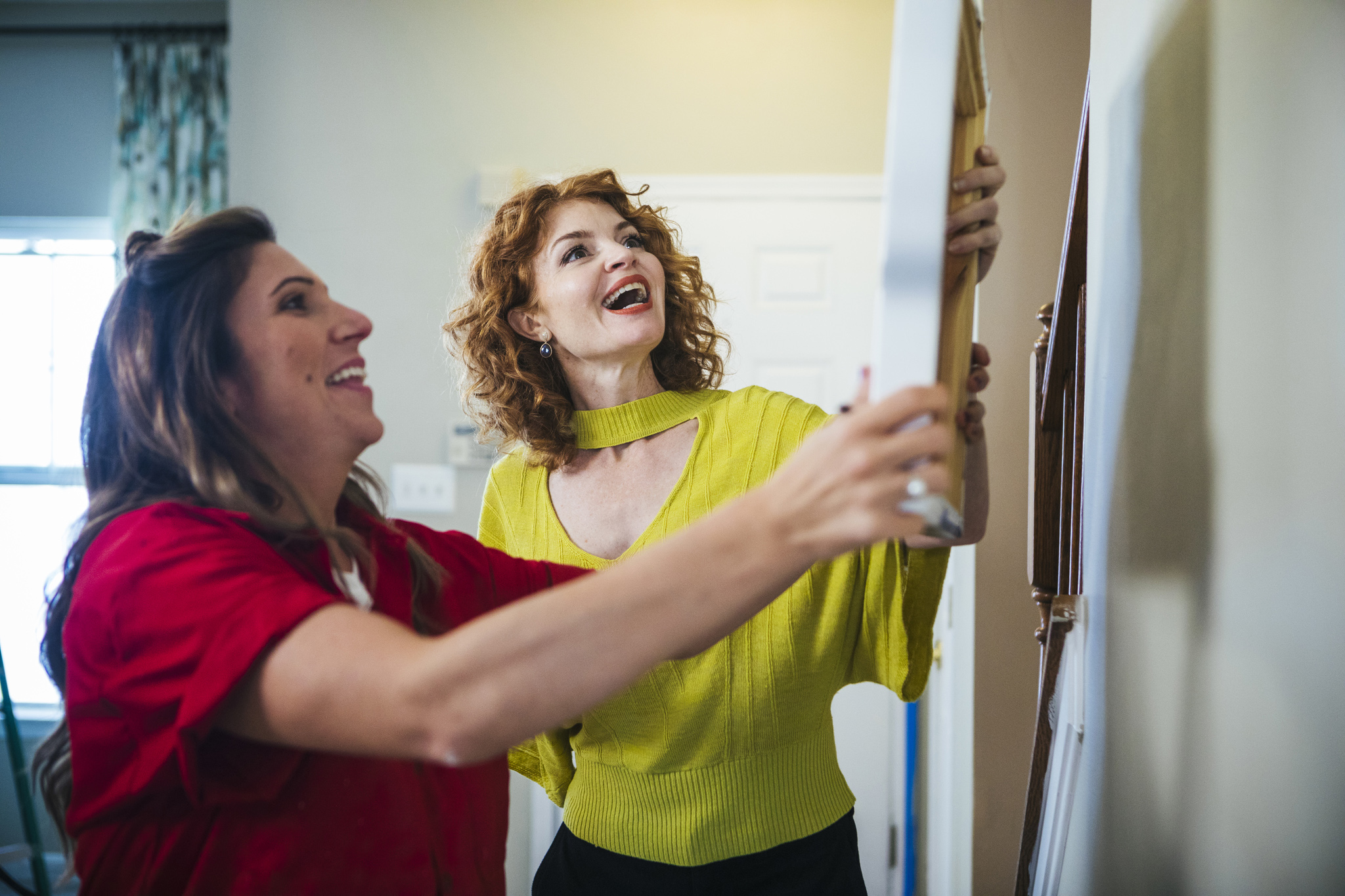
1. Pictures should be hung 60 inches from the top of the floor to the middle of the artwork, the middle of the mirror or the middle of the grouping of artwork pieces, unless it's over a fireplace mantel or a headboard.
2. A light fixture over a dining room table should be hung 66 inches from the top of the floor to the underside of the light fixture.
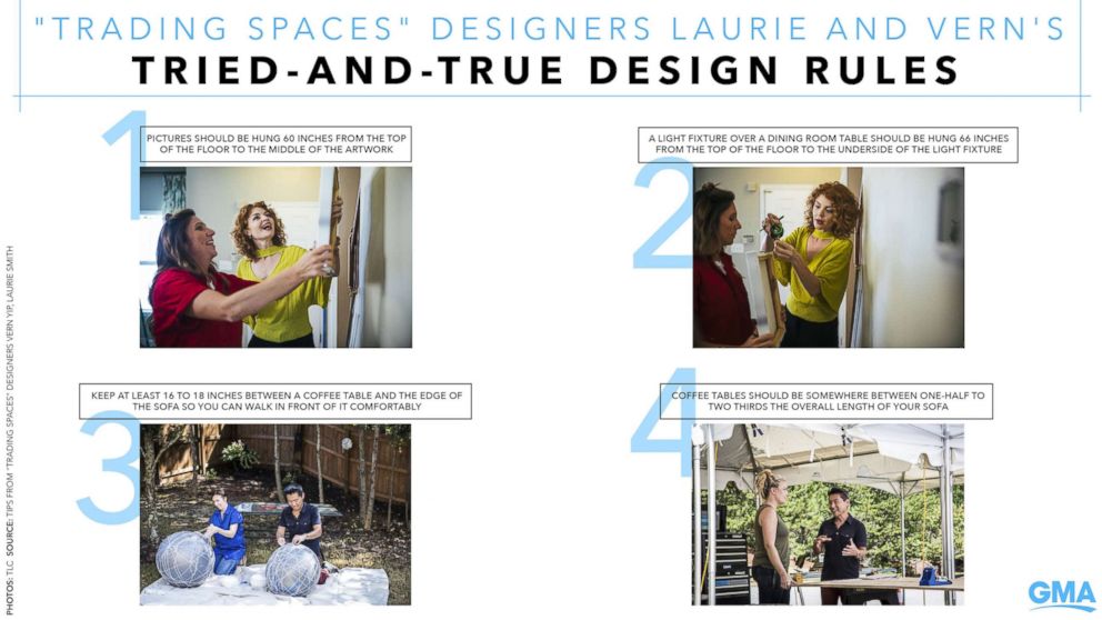
3. Keep at least 16 to 18 inches between a coffee table and the edge of the sofa so you can walk in front of it comfortably.
4. Coffee tables should be somewhere between one-half to two thirds the overall length of your sofa.


