Google+ Redesign Further Mimics Facebook

(Image Credit: Google's Blog)
A whole lot of reorganization and a fair amount of simplification are on the way over at Google+. Google announced the changes to its social network this morning on its blog, which the company says will roll out in the next few days.
Some changes involve additions that no other social network has, others strive to keep up with Facebook's additions in the past year. Can Google+ Timeline be far behind? Let's break down the new design.
Now More Like Facebook
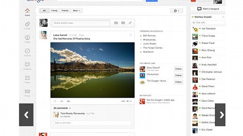
- In the most blatant Facebook copy-paste job, Google+ is now featuring large banner images on profile pages. It's not shying away from mimicking any Facebook terminology here, declaring this new photo to be your "cover photo." It's a bit thinner and partially obscured by your profile picture, but the idea remains the same.
- What used to be a mix of navigation between a top bar and a column on the left-hand side of the page is now all navigation panes that have been set to a left-hand side "navigation ribbon," ala Facebook. Google is also finally letting you organize the order of how the icons are displayed.
- Google chat lists will flip to the right-hand side of your feed, in the same area where chat currently resides on Facebook.
Aside From Facebook
- Google+ is putting "hangout" front and center with a dedicated page to the function. It will feature a "rotating billboard of popular hangouts, pro tips and other items you don't want to miss."
- Photo albums will be better surfaced, popping up when you hover over photos in the feed. Larger photos and videos will also fill your news stream.
- Google+ has YouTube sharing cornered, literally. It will place "share" icons in the upper right-hand corner of the video sharing site for easy access while viewers browse.
- Another new dedicated page highlights what is trending. This information could usually be surfaced when searching, but the new "Explore" module lets you browse Google+ topics with high share rates without needing to have a specific query in mind.
Some signs point to Facebook duplication, others to a larger integration across its search and video Web portals. Brian Solis, Altimeter Group's principal analyst and author of "The End of Business as Usual," told ABC News that the network's changes "show promise," noting that "the world doesn't need another Facebook. And, Google must communicate its long-term vision to help the company continue the momentum its building on today."
He added, "In the future, Google's value will be greater than just search and social, it will be the integration of Google's business and lifestyle services into one seamless experience that serves as a personal OS … a digital hub for people to share, communicate, transact, work, learn and collaborate."
Get the full details on the changes at Google's blog. Do you have the new Google+ yet? What do you think of the redesign?