Polling 101: Why Obama's Sagging Approval Is Tied to Gas Prices
(Image Credit: Gene J. Puskar/AP Photo)
First, the all-important lesson when it comes to polling: don't ever read too much into one poll. Instead, look at the trend.
Here are polls that have tracked President Obama's approval rating and were published between March 7 and March 11.
| Poll | Date | Sample | Approve | Disapprove | Spread |
| CBS News/NY Times | 3/7 - 3/11 | 1009 A | 41 | 47 | -6 |
| ABC News/Wash Post | 3/7 - 3/10 | 1003 A | 46 | 50 | -4 |
| Gallup | 3/9 - 3/11 | 1500 A | 49 | 43 | +6 |
While the CBS/New York Times poll shows Obama with a markedly lower approval rating than ABC/Washington Post, the disapproval ratings are basically the same. Moreover, if you look at the spread, ABC /Washington Post and CBS/New York Times are basically showing the same thing: Obama is upside down in approval rating by anywhere from 4 to 6 points.
If anything, Gallup, which shows Obama at +6, looks more like the outlier.
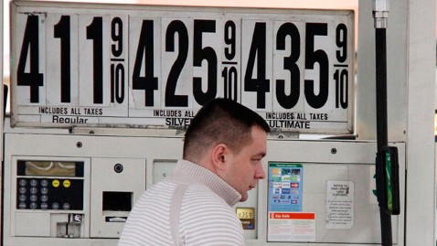
The second lesson from recent polls is that gas prices impact lower-income people disproportionately.
That may sound like a "DUH," but this is also a likely explanation for Obama's drop in approval rating.
Take a look at the ABC/Washington Post cross-tabs for some interesting details.
Lower-income folks had highest disapproval/lowest approval for Obama than any other group.
Overall approval by income:
Under $50K: 44/52 (-8)
$50-$100K: 47/48 (-1)
Over $100K: 47/51 (-4)
That approval rating by income with tracks with who is hurt most by rising gas prices - those making less than $50,000
In the ABC / Washington Post poll we asked, "Have recent gas prices caused any financial hardship for you or your family? Has that been a serious hardship or not serious."
Serious Hardship
Total: 36%
Under $50K: 48%
$50-$100K: 24%